In our previous blog, we talked about first impressions – from your photo to your headline, and how quickly recruiters can form an opinion when they open your CV.
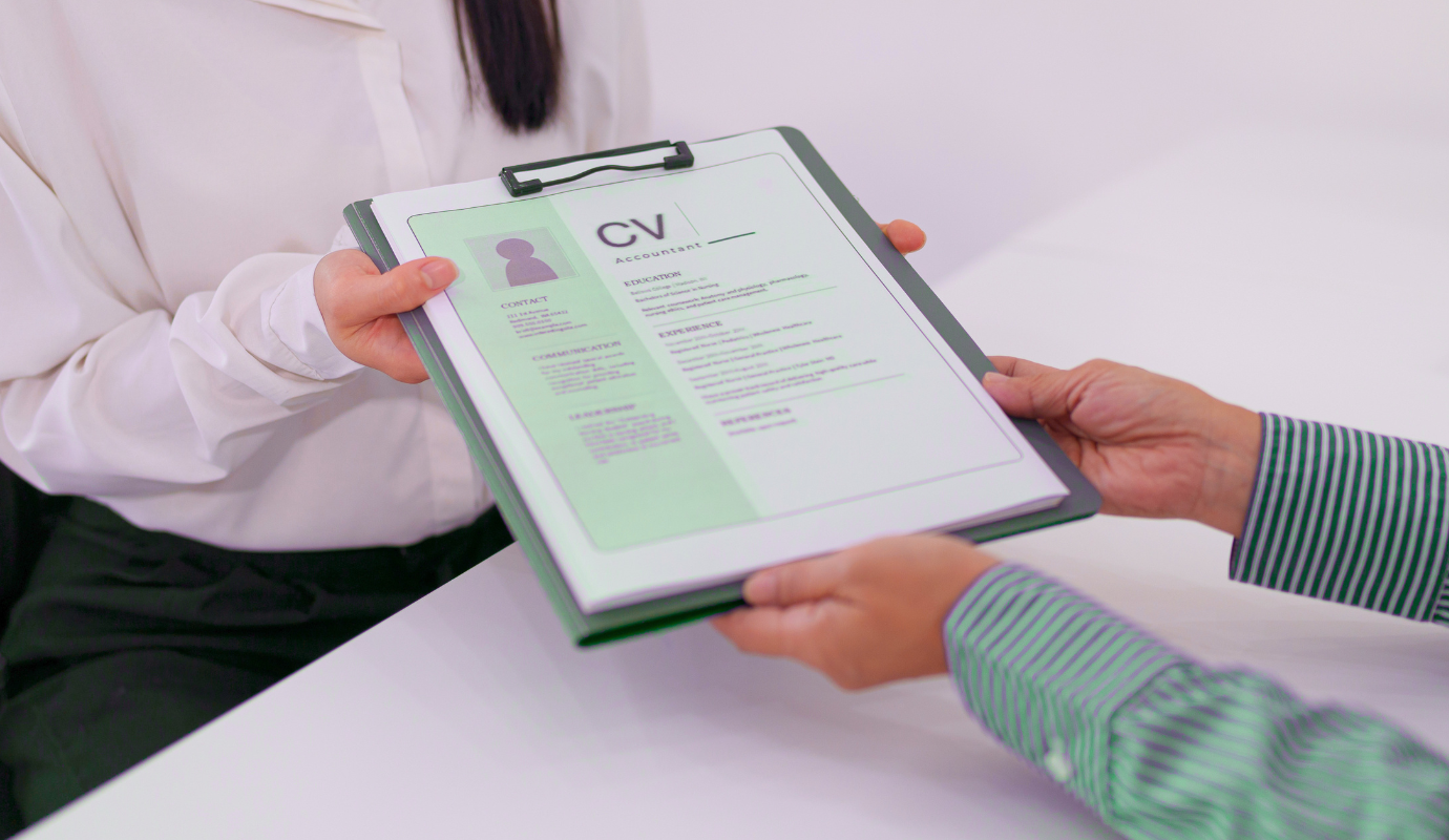
But even with a strong profile, there is another factor that can immediately influence how professional your CV feels: the layout. Many expats assume their CV needs to stand out visually in order to get attention. More colour, more graphics, more design.
But in the Dutch job market, that is rarely what recruiters are looking for. Most of the time, they simply want to find information quickly and understand your profile without effort.
Structure creates readability
A good CV layout is not about fancy designs. It is about structure. Simple formatting choices often make the biggest difference – clear section titles, consistent spacing, aligned dates and job titles, and a logical order of information. These details help create flow across the page and make the document feel easier to navigate.
And honestly, this is where many CV templates become too complicated.
It is easy to see why expats reach for visually impressive templates. When you are new to a job market and unsure what will stand out, a polished design feels like a safe bet. But in practice, the templates that look the most impressive are often the hardest to read.
A few things to avoid: two-column layouts that split your experience awkwardly, dark or heavily coloured backgrounds that make text harder to scan, and design elements like icons or progress bars that take up space without adding information. These features might look modern, but they slow a recruiter down at exactly the moment you want them to move quickly through your profile.
A single-column layout with clear section headings, consistent fonts, and enough white space to breathe will almost always outperform a heavily designed template. It does not need to be boring – it just needs to be easy to read.
Fonts, spacing, and visual consistency
Beyond layout, the smaller visual details matter more than most people realise. They are easy to get wrong, especially when a CV has been updated multiple times over the years.
Font choice is one of the most overlooked details on a CV. Mixing two or three different fonts (sometimes without even noticing) immediately makes a CV feel less polished. Stick to one font throughout, or at most two if you want to differentiate headings from body text. Clean, readable fonts like Calibri, Arial, or Georgia work well. Decorative or overly stylised fonts might look interesting but they slow down reading, which is the opposite of what you want.
Spacing is another area where small inconsistencies add up. Uneven margins, varying gaps between sections, or bullet points that don’t align properly all create a subtle sense of disorder. It does not need to be perfect, but it does need to feel intentional. When a CV looks like it was assembled carefully, it signals the same about the person behind it.
Colour is fine to use in small amounts – a subtle accent on headings or section dividers can actually help with navigation. But the moment colour becomes the main visual feature, it starts working against you. Keep it minimal and make sure it still looks clean when printed in black and white, since that does still happen.
The order of information matters too
The way information is positioned on your CV also changes how your profile is read. For many expats and recent graduates, it often makes sense to place education before work experience, especially when the studies are closely related to the role.
But this is not a fixed rule.
Once your experience becomes more relevant or stronger than your education, it usually makes more sense to place your work history first instead. Again, the goal is readability. The most relevant information should be the easiest to find.
The way you present experience matters too
Even strong experience can feel overwhelming when it is presented in large blocks of text. That is why bullet points are often much easier to read than long paragraphs.
But not all bullet points are equal. A common mistake is writing bullet points that read more like a job description than a personal contribution. “Responsible for managing customer inquiries” tells a recruiter what the role involved. “Handled customer inquiries across three languages in a high-volume environment” tells them something about you specifically.
This is also worth keeping in mind if you are using AI tools to help write your experience descriptions. AI tends to generate long, formal bullet points that sound impressive but say very little. “Demonstrated strong leadership capabilities while overseeing cross-functional initiatives” is the kind of sentence that looks polished but gives a recruiter almost no useful information. Shorter, more specific descriptions in your own words will almost always land better.
The goal is not to describe every task you have ever done. It is to highlight the parts that are most relevant for the role you are applying for now, and to phrase them in a way that gives a real sense of what you actually did and how you did it. When too much information is added without that focus, the main message of your CV can quickly become unclear.
Why simple formatting also matters behind the scenes
There is another reason to keep your CV clean that many candidates don’t think about. A lot of companies (particularly larger ones) use software to scan CVs before a human ever reads them. These systems, often called applicant tracking systems or ATS, are looking for keywords and relevant information. But they struggle with complex layouts.
Two-column formats, text boxes, tables, and graphics can confuse these systems entirely. Information gets misread or missed. In some cases, a CV that looks great on screen arrives in the recruiter’s inbox as a jumbled mess of text.
A simple, clean format is not just easier for recruiters to read. It is also far more likely to pass through automated screening without any issues. One more reason why straightforward often works better than clever.
Keep it focused
Another common question is CV length. For most roles in the Netherlands, one to two pages is completely enough. Even with years of experience, relevance is usually more important than completeness. A shorter, focused CV is often far more effective than a long document filled with unnecessary detail, especially when recruiters are reviewing multiple profiles back to back.
Next up: showing your value clearly
Now that the structure and layout of your CV are in place, the next step is making sure recruiters quickly understand the value you bring. In our next blog, we’ll talk about CV skills and achievements, and how to present your experience in a way that feels stronger, more relevant, and easier for recruiters to connect with.
Want to read more?
For more resources and insights, visit our blog. You can also follow us on Facebook, Instagram, and LinkedIn to stay informed on everything we share.